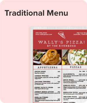
 Menus
Menus
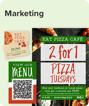
 Marketing
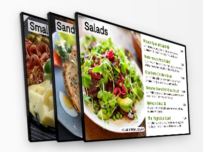
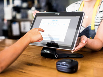
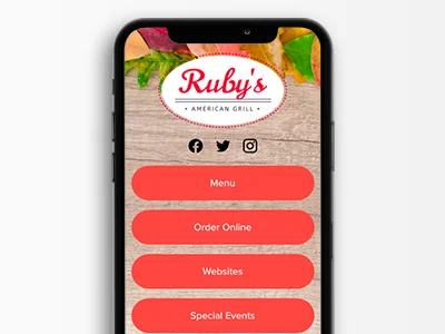
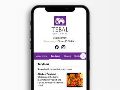
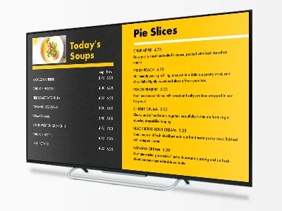 Display Menus
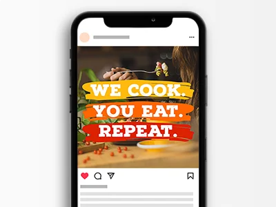 Social
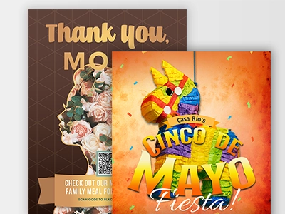 Seasonal

RESTAURANT STARTUP GUIDE
Menus, Marketing, & Management tips to grow your restaurant business.
- Design Ideas to Transform Your Breakfast Menu
- Christmas Menu Design Tips
- Dine-In Menu Printing: How To Optimize Your Menu Design and Printing
- How to Design a Fancy Fine Dining Menu
- How to Design a Great Food Cart Menu
- How To Create A Memorable Food Cart Menu
- French Restaurant Menu Design
- Golf Course Menu Design
- Happy Hour Menu Ideas To Make Your Menu Standout
- Increasing Sales with Your Restaurant Menu
- Menu Engineering 101
- Kids Menu Ideas
- Landscape Menu Design
- Menu Design Ideas
- Menu Prices
- Menu Printing
- Restaurant Menu Design Tips
- Menu Writing Success
- Why Choose a Tri-fold Menu Design
- Design Tips for a Wedding Menu
- Wedding Menu Ideas
- Layout and Design Tips for a Wine List
Basic Restaurant Menu Layout
The Six Principles of Restaurant Menu Design
When sitting down to design your menu, make sure that the menu layout is specific to your restaurant or event. Brainstorm a bit, think about what makes your restaurant unique. The thoughts that come to mind will help give your menu a unique style and flavor all its own. Careful attention to your menu's layout can help you do that. Even if you are a novice designer, following these general principles will result in a dynamic, professional menu customers love.
Principle #1: Page Size Comes First
- Menu size is the first and most important design element. Generally this is dictated both by the number of dishes you offer as well as the look you desire.
- Family restaurants that offer tons of options and lots of kids' fare do well with Tabloid-Size Menus that fit everything in one place. Less option-heavy, more upscale restaurants often prefer standard sizes.
- Drinks, specials, happy hours and occasions often benefit from their own menu sizes, so consider your needs before choosing a page size.
Principle #2: Columns Make a Statement
- Typically, fine dining restaurants choose a single column and wide margins for simple, elegant appeal. This is also true of other limited-selection menus, like daily specials or happy hour menus.
- Family-oriented restaurants often use multiple columns on front and back to contain their wider range of items, as do cafes and pubs.
- Keep in mind that items with long descriptions don't look as nice squeezed into a column as those with shorter or nonexistent descriptions.
- Also remember that menus with only one column tend to be boring unless you pay special attention to getting placement, emphasis, proportion and balance right.
Principle #3: Placement Affects Visual Appeal
- Much of placement is dictated by the progression of the meal (from Starters to First Course to Second to Dessert, for instance), but you have room for creativity, so use it.
- In a multiple-column menu, play with placing categories below versus next to each other. Salads might go directly below Soups, for example, or look better to the right.
- Ensure roughly the same number of dishes between two columns and on the front and back of a menu to avoid a petered-out effect. Distribute logos and graphics evenly, like this Cafe Menu.
Principle #4: Emphasis Draws Attention
- A highlighted box or colored area, like the one used in this French Menu, will quickly draw a customer's attention.
- Increased negative space (white or empty space) around a column, category or menu item will draw the eye toward it.
- Categories with only one item will always draw attention. If your restaurant serves a single dessert (like flan at a Mexican restaurant) or has a long-offered specialty, place these items in a category by themselves.
Principle #5: Proportion Signifies Choice
- Menus with similar numbers of dishes in each category assure customers they have choice, so break sections up as evenly as possible.
- Consider combining categories with only one or two items each, like putting soups and salads both in “Starters.” Conversely, break up categories that are overly dense by using subcategories.
- If you have tons of beverages, don’t crowd them on to the back of an otherwise elegant menu. Use a separate Drink List and divide them proportionally.
- Make sure sections that don’t require descriptions (sides, beverages or kids’ items) are laid out similarly to everything else.
Principle #6: Balance Is Beauty
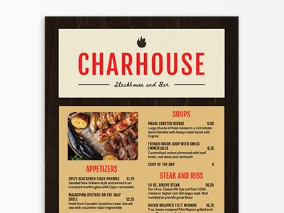
- Your restaurant name and logo should balance with the rest of the menu in both size and appearance. Make sure they stand out without taking over, like this Steakhouse Menu.
- All columns of your menu as well as its front and back should contain roughly similar amounts of text. If necessary, rearrange your sections or break them up differently to achieve good flow.
- Negative space is important. Use it to set off elements that you want people to notice.
- Balance is achieved when all sections of your menu echo the others. Consistency will result in beauty with little effort on your part.
![]()
![]()
![]()
Print with Us!
High-quality printing for menus, flyers, business cards, and all the essentials you need to run a successful restaurant.
Ships next business day!